
DataLynn - All-in-One Guide for AI Career
Restructuring IA and Creating a Scalable Design System for Seamless Growth and Development
DataLynn is a pioneering AI startup offering a comprehensive platform for AI education, job search, and project competitions. It aims to lower the barriers to entry in the AI industry by providing a user-friendly data platform and standardized AI solutions to help users address diverse business challenges.
ROLE
UX designer
DURATION
Jan 2024 - Sep 2024
DELIVERABLE
Strategy, Information architecture, Wireframes, Hi-Fidelity UI, Prototypes, Design systems, Final specs

Background:
While studying at Brandeis, I chose to redesign DataLynn—a startup led by a friend facing major usability and scalability issues due to a fragmented product framework and poor page flow—as my semester-long project. The final deliverable was an improved version based on a full IA analysis and iterative design.
Problem Statement
The DataLynn website struggled with usability and scalability due to a lack of clear product structure and smooth page flow. Frequent redesigns led to code rewrites and inconsistent visuals, while the absence of a unified design system resulted in fragmented interactions and poor maintainability.
Designing
a Better
Experience
Redesigned for greater intuitiveness and convenience for users and team
Solution
To address these challenges, I restructured the entire IA (information architecture) and introduced a modular design system to ensure visual consistency, interaction coherence. I created a scalable component-based UI framework that allowed the developer team to easily maintain and expand.

Wireframes

A THOUGHT-OUT PATH FROM THE BEGINNING TO THE END
ATTENTION IN PROTOTYPING EACH SCREEN AND ELEMENT
Site Version

(139 screens)
App Version

(139 screens)
Scalable Component
Color
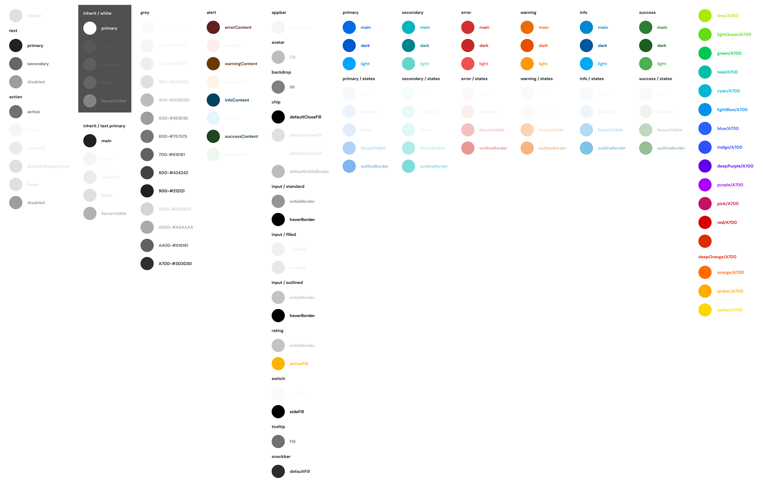
Logo
Icons
Table

Input
Used for user interaction feedback prompts

Search
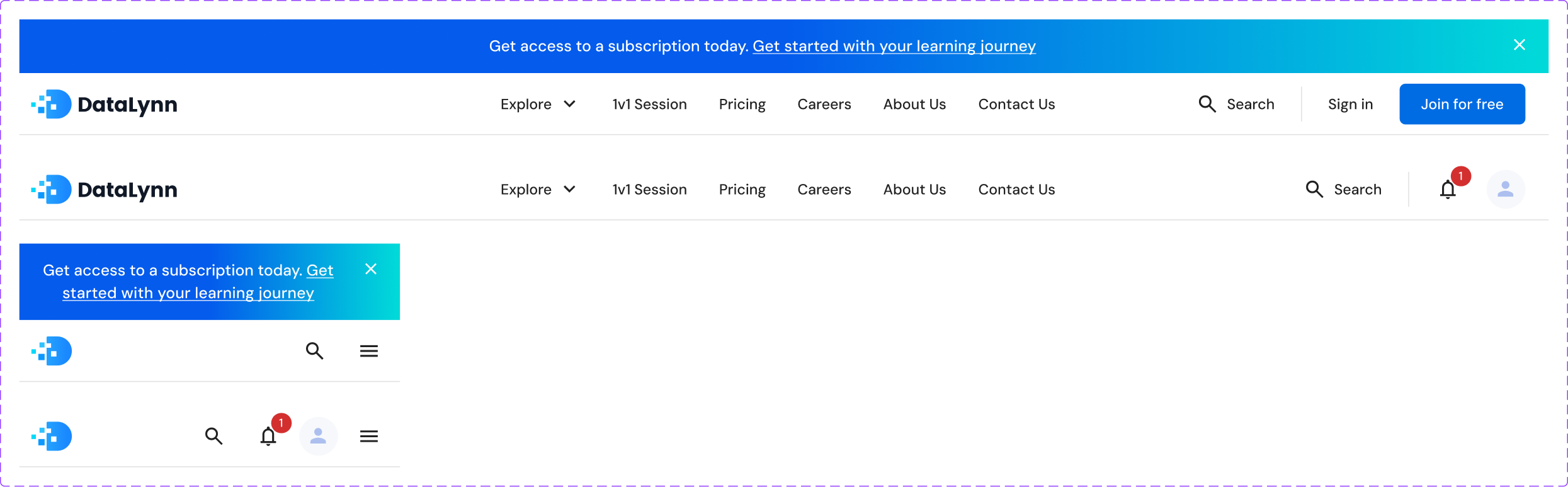
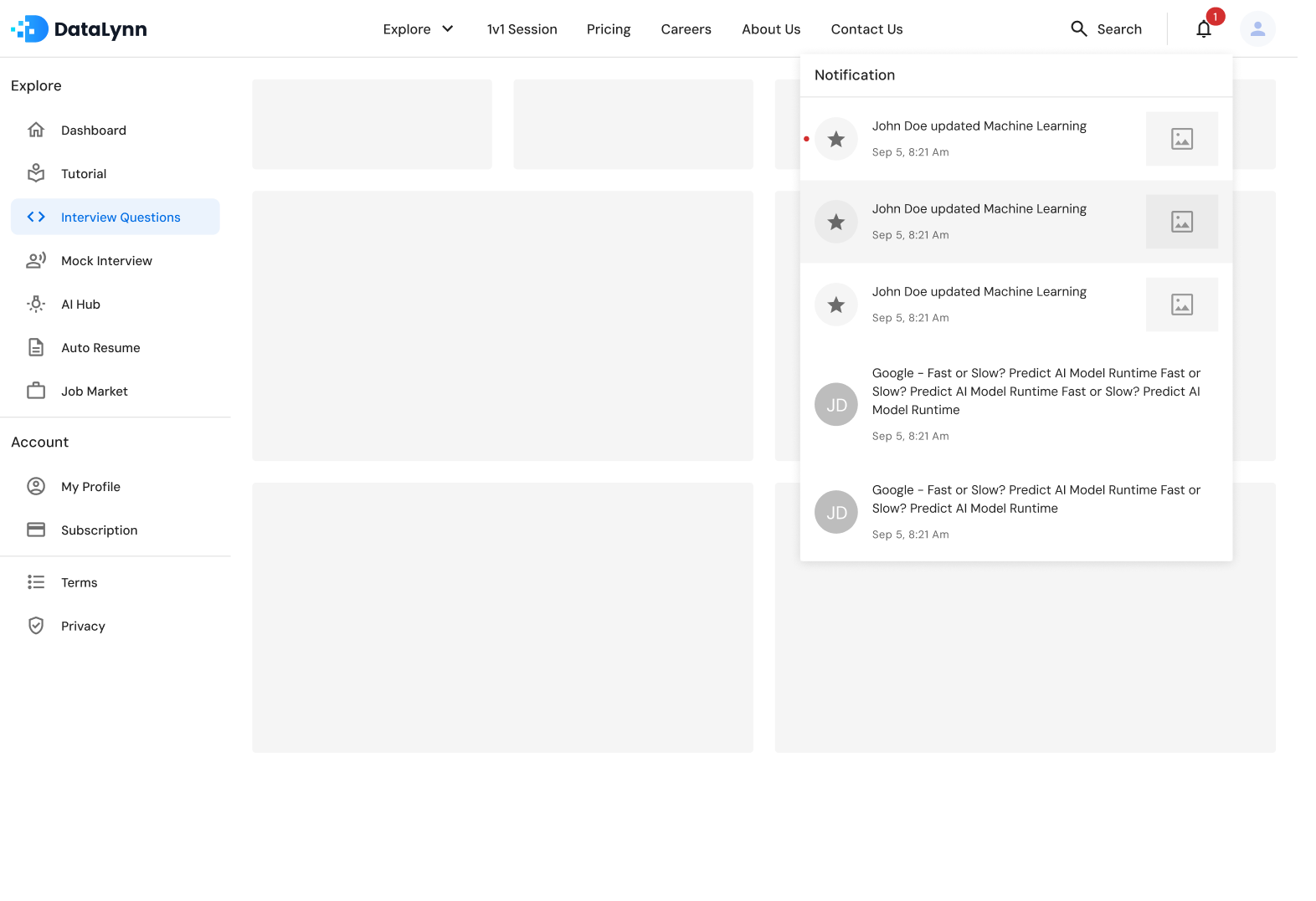
Navigation

Dashboard
Navigation

Card component
Navigation

Tutorial V1.0


Header
Dashboard
Navigation

Card component
Navigation
Illustrating
Key
Features
Ensure visual
consistency and
interaction coherence

(139 screens)
Login Page

Tutorial Section
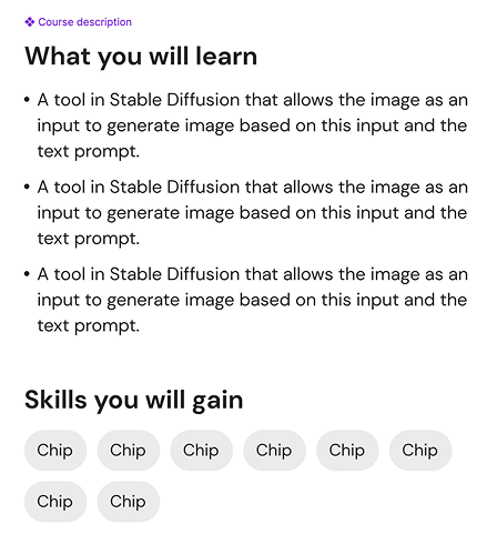
This feature provides structured, up-to-date courses for tech roles, guiding users from fundamentals to real-world skills, including tutorials on the latest AI tools.

Interview Questions
This feature offers interview questions based on real tech role scenarios and frequently tested topics.

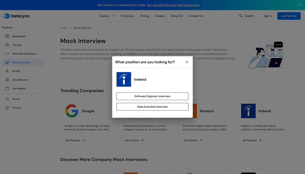
Mock Interview
This AI-powered tool simulates real tech interviews, helping users practice communication, coding, and data analysis skills. It also provides instant feedback and improvement suggestions after each session.
Looking for job position

Looking for job position
Interview process
Behavior Interview-start

Coding Interview-click to answer

Coding Interview-testcase

Coding Interview-testcase error

Coding Interview-Result


AI Hub
A community platform where users enhance resumes through curated projects, explore innovative AI tools and business models, and join real-world collaborations with companies and governments to earn rewards.
AI Hub / My projects


AI Hub / Details / Overview

AI Hub / Details / Dialog

Problem Solved
Navigation & Information Architecture
- Pain point: Users struggled to find key features due to unclear navigation hierarchy.
- Solution: Restructured the IA and Introduced clear labels aligned with user mental models.
Design Consistency / System
- Pain point: Inconsistent visuals and interaction patterns across pages led to confusion.
- Solution: Developed a modular, component-based design system with clear usage guidelines.
Feature Discoverability
- Pain point: Critical features buried in secondary menus were often missed.
- Solution: Repositioned high-value actions and added onboarding highlights.
Task Efficiency
- Pain point: Users took too many steps to complete routine actions.
- Solution: Simplified workflows and reduced redundant interactions.
The design was validated through iterative user testing and stakeholder reviews
1.
Task time reduced by 60% and improved first-click success
2.
Increased feature discovery and usage rates by 3×
3.
Improved interface coherence.
Positive Feedback
Even though the product was never officially launched, this demonstrated a significantly better user experience for critical tasks.

“This took half the time compared to the last version. Fewer steps, less frustration.”

“Oh—I didn’t even realize that feature was there before. Now it’s super easy to find.”

“The pages finally look and behave consistently, which made the whole experience feel smoother and more reliable.”
-User testing participants
“The prototype aligns perfectly with our vision and makes the features incredibly clear and easy to follow.”
— DataLynn CEO
“This will be incredibly helpful in reducing design-developer iteration cycles and improving overall efficiency.”
— Developer
“This project demonstrates a strong grasp of user-centered design principles and showcases the ability to translate complex ideas into intuitive, accessible experiences.”
— Professor