
XENARA- Leading Conversational AI Innovation
Xenara AI Website V2 — Redesigned & Launched with Figma + Framer
I joined Xenara Inc. as a UI/UX Designer, contributing to the redesign of the official website (V2) and supporting the UI/UX design for the platform. Working closely with the lead designer and cross-functional teams.
My most significant contribution has been the launch of Xenara V2. Starting in May, I took ownership of the redesign process—creating a modern, user-focused experience that clearly communicates Xenara’s value. I continue to work with the team to conduct usability testing, address minor issues, integrate feedback and additional content from the CEO, and ensure the site remains adaptable to evolving business needs.
ROLE
UI/UX designer
DELIVERABLE
Iteration, IA, Wireframes, High-Fi UI, Interactive Prototypes, Multi-screen adaptation, Final Specs, Cross-functional Collaboration, Teamwork
TIMELINE
May 2025 - Aug 2025
TOOL
Figma / Framer
Outstanding Contributor
As one of Xenara’s UI/UX designer, I played a key role in bringing the new Xenara Website – V2 to life, recognized by the CEO as an outstanding contributor in the official announcement.


The V2 redesign positioned Xenara as a clear, credible, and customer-ready product by simplifying how its conversational AI capabilities were explained and demonstrated. Through a cleaner UI, restructured information architecture, and engaging product storytelling, the website reduced confusion around complex AI features, highlighted real-world advantages, and built trust with prospective customers.
Maximize Redesign Impact


Iteration Process
The Xenara website redesign was a pivotal UX achievement, transforming a complex AI product into a clear, accessible, and engaging experience.
By emphasizing usability, visual cohesion, and intuitive communication, we enabled users to quickly grasp Xenara’s value, built trust in the brand, and created a scalable foundation that supports ongoing adoption and product growth.

.png)

.png)
V2 Optimization Journey

❌ Inconsistencies in Visual Design
❌ Jargon-heavy feature explanations
❌ Cluttered navigation
❌ Low trust & conversion

✅ Established a Design System
✅ Defined Style Guidelines and Components
✅ Ensured Consistent Visual Style
✅ Streamlined Navigation and Hierarchy to Improve Usability
✅ Simplified Complex AI Features into Visuals + Benefit-Driven Storytelling
✅ Strengthened Credibility &CTAs

- Horizon Travel onboarded in 1 month
- Meta partnership → WhatsApp Business integration
- Notion integration in 3 months
- Stakeholder validation & market credibility


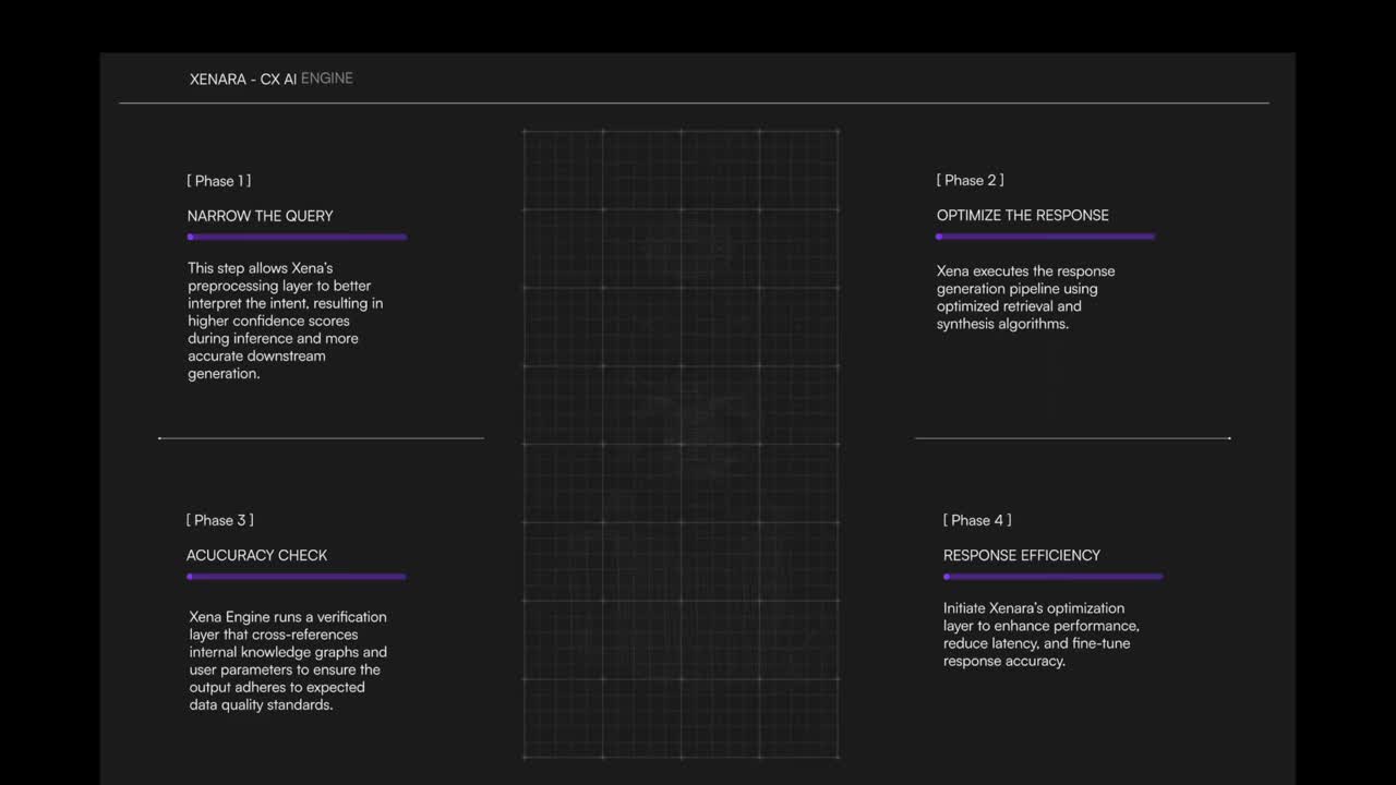
Collaborated on the redesign of the Xenara V2 website, focusing on organizing the logical hierarchy, IA, and overall user experience. Participated in brainstorming, lo-fi wireframing, design critiques, and iterative improvements, resulting in a cohesive and user-focused final design. The following are some examples of the design process that demonstrate our work.
Example 1
To make this page more visually appealing and effectively communicate the mission as an expert in AI agents, we began brainstorming and creating a few lo-fi wireframes in Figma, incorporating stakeholder feedback.


Through iterative brainstorming and exploration of multiple concepts, we finalized a design that highlights key features in a modern, user-friendly layout—resulting in a more intuitive and visually compelling experience.
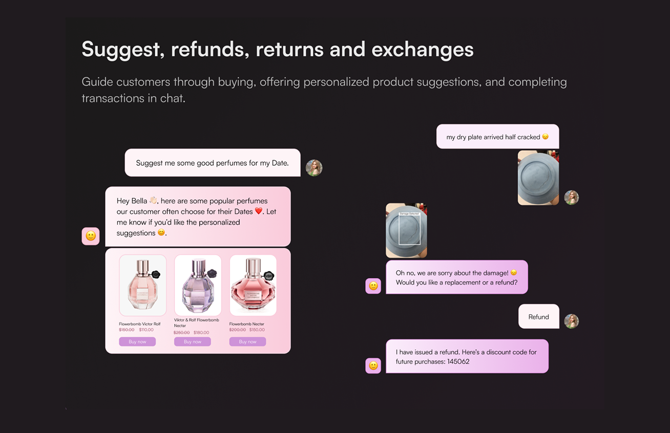
Example 2
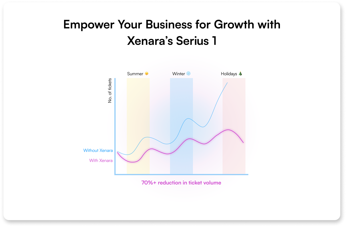

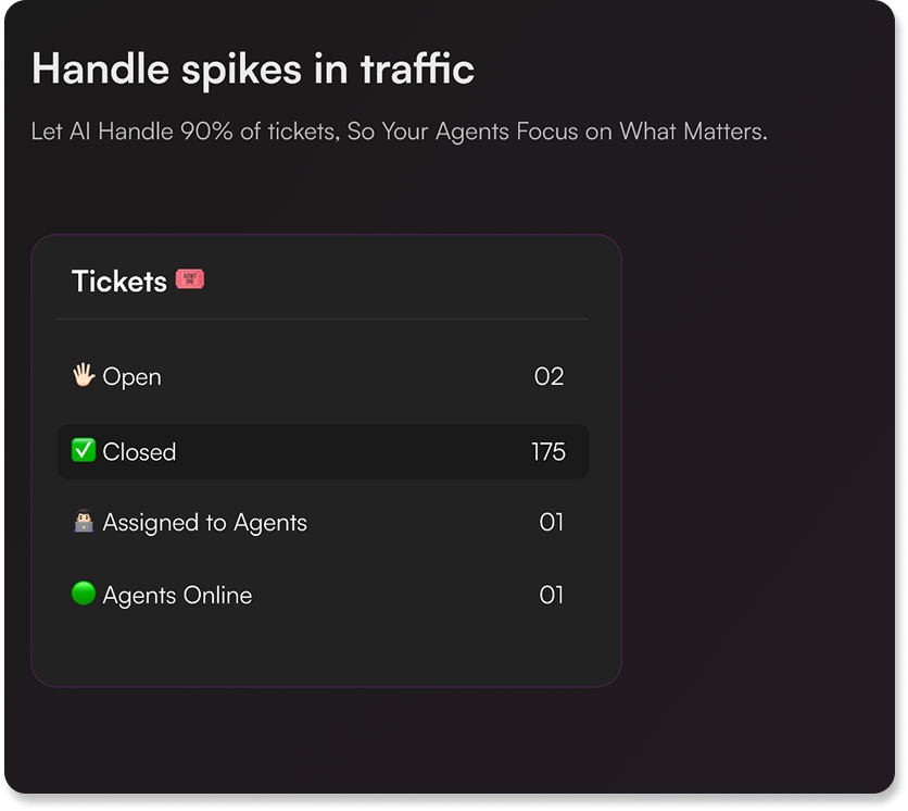
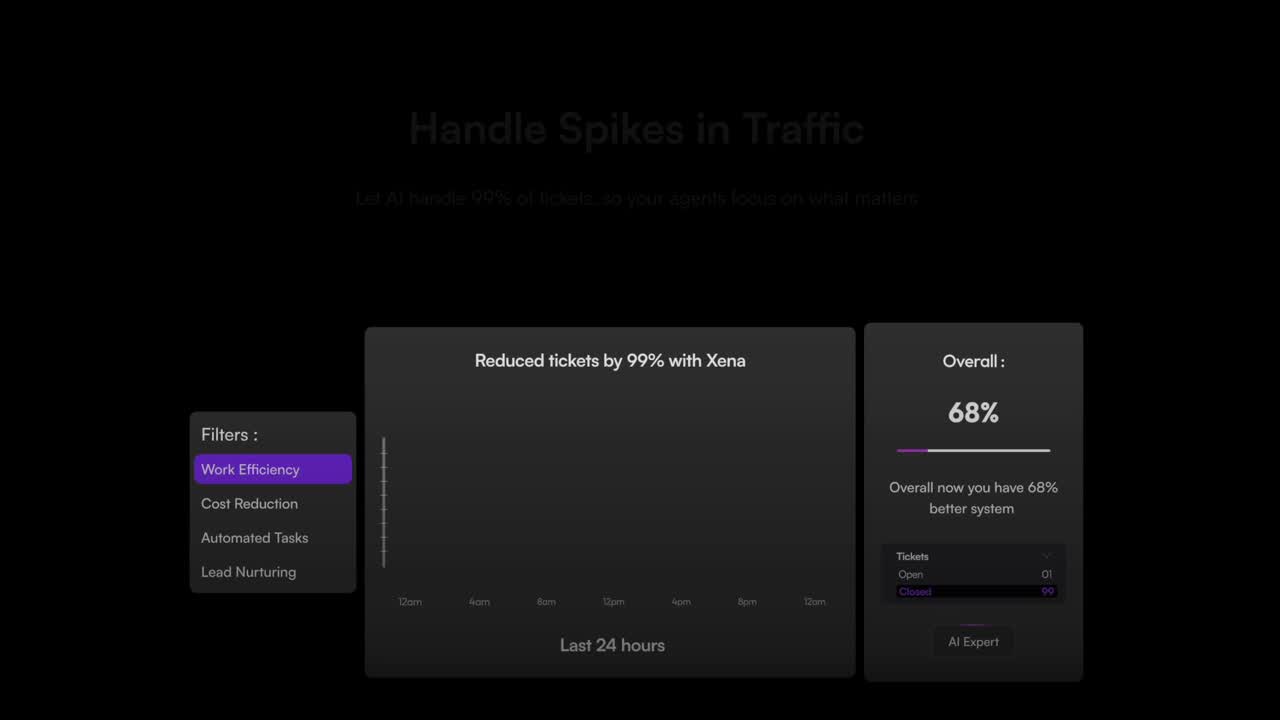
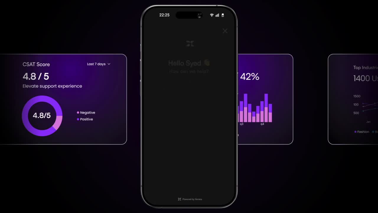
Redesigned the product page by merging two sections into one cohesive layout and visualizing key data through line and pie charts (two ways) to showcase how Xena handles traffic spikes. Final design (Draft 2) was selected after team reviews and feedback.
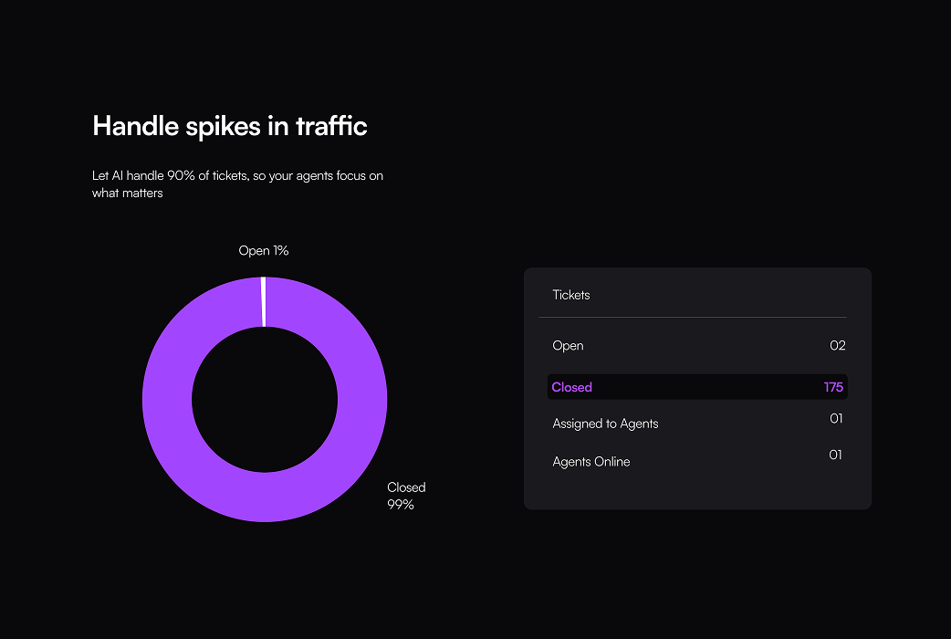

I optimize the line chart with filters and overall section, this version deliver more info and reflects the efficiency of Xena as a high-tech agent through visual presentation.
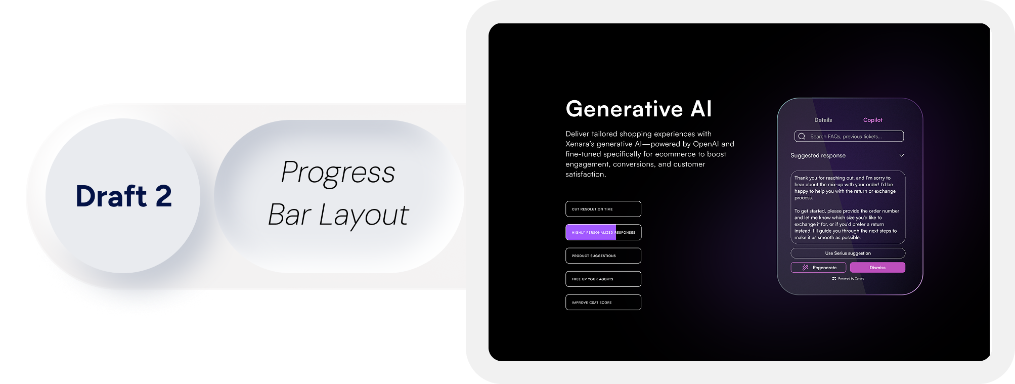
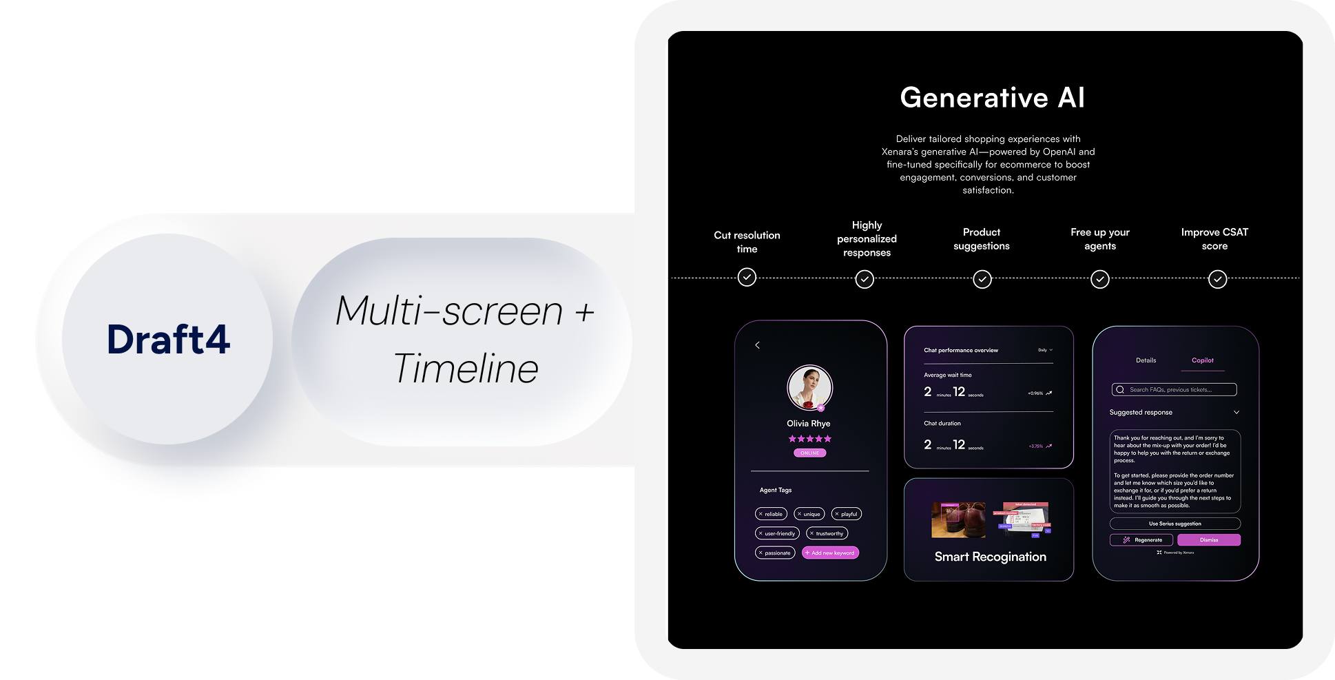
EXAMPLE 3
Created 6 drafts exploring visual hierarchy, messaging clarity, and interaction design to ensure this section effectively communicated the brand’s value at the beginning of the Xena page, while giving stakeholders multiple options to evaluate and refine.

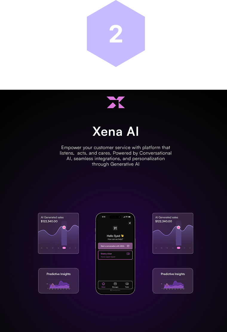
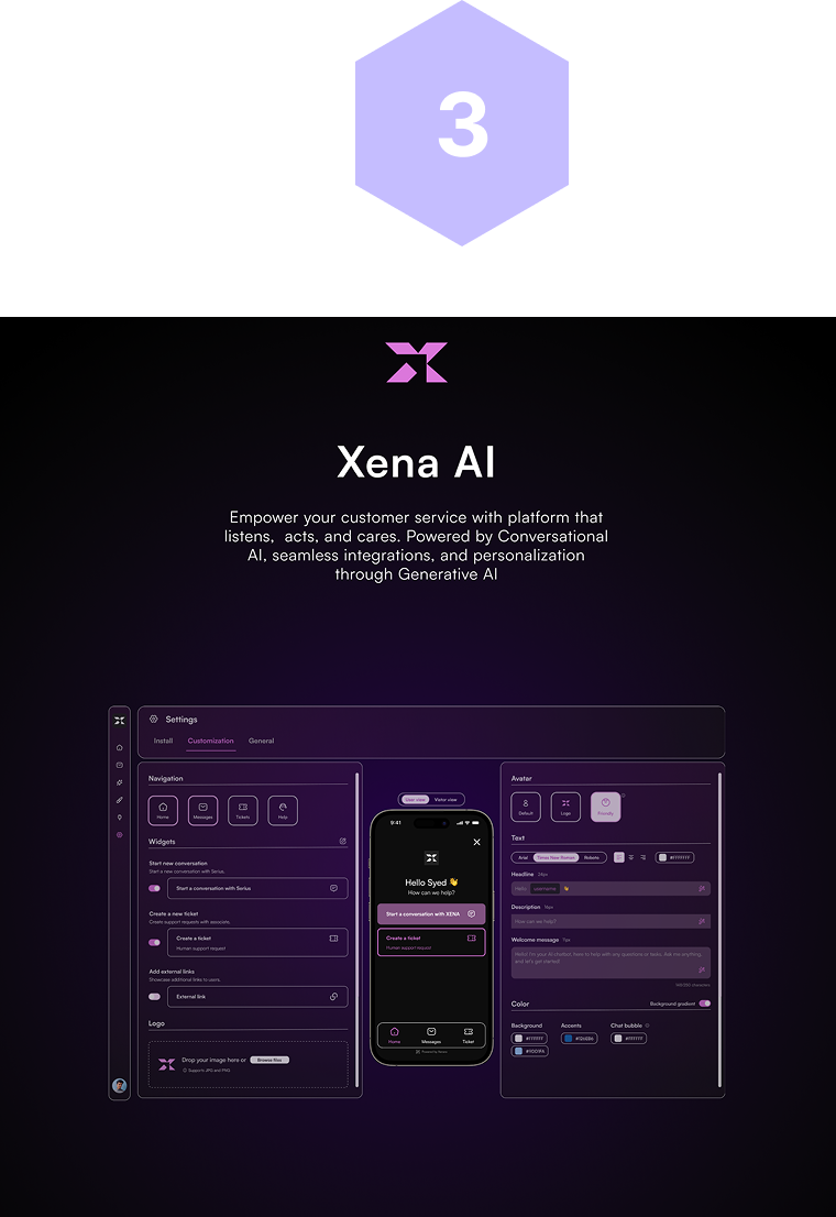
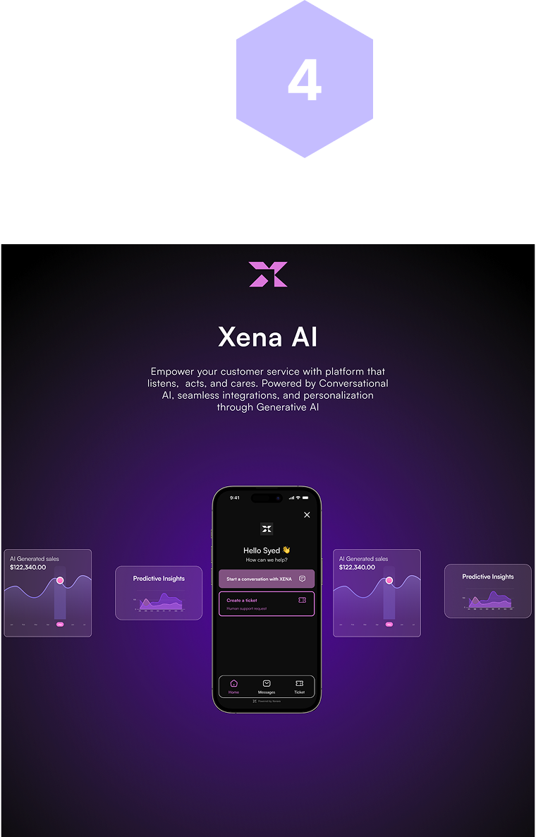
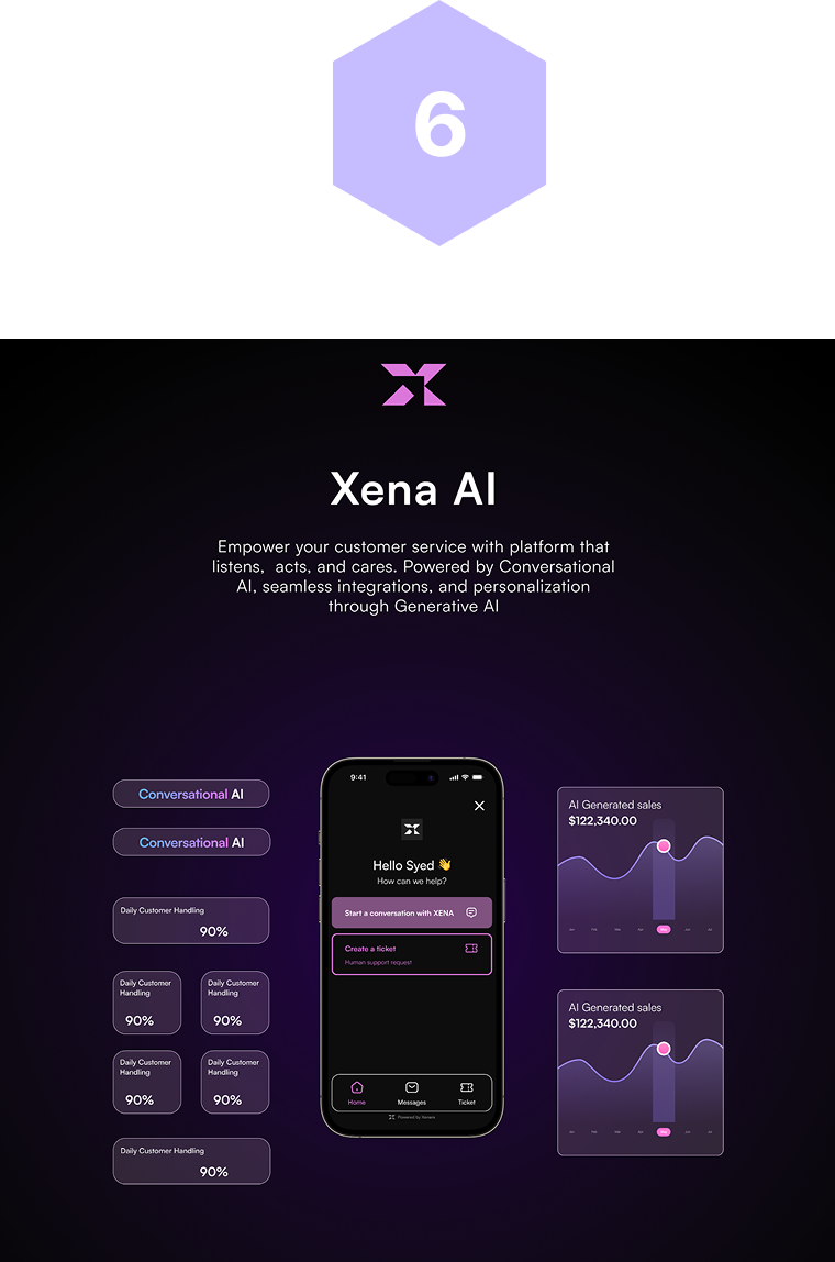
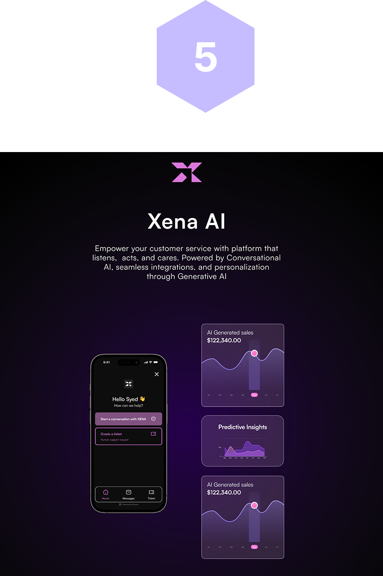
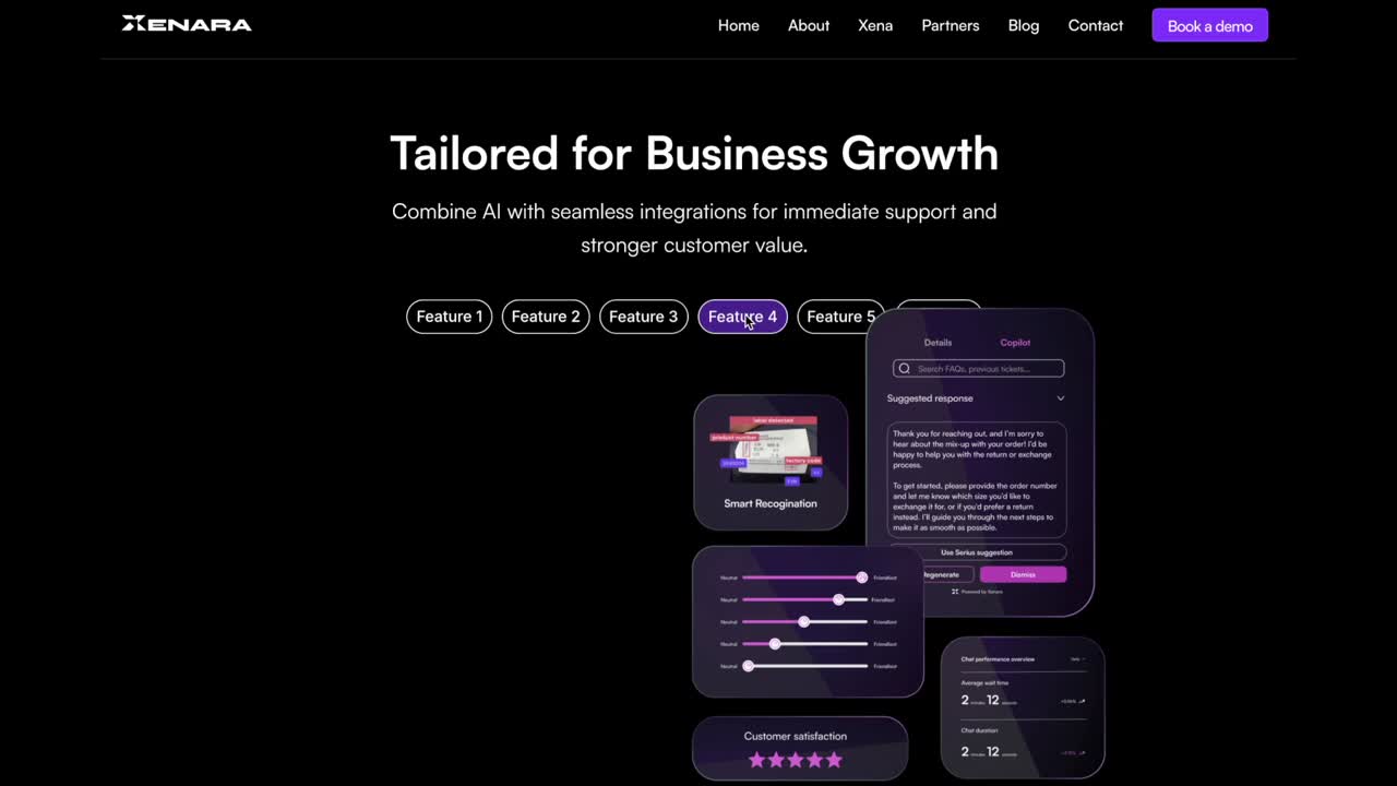
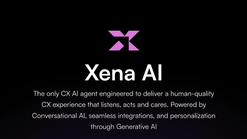
This page effectively showcases Xena AI with a strong visual hierarchy, placing the mobile UI mockup at the center to highlight the product in action. Clear messaging communicates the platform’s value, while consistent branding, cohesive colors, and clean typography create a professional, modern look.
More


.png)
